Coffee Box Design
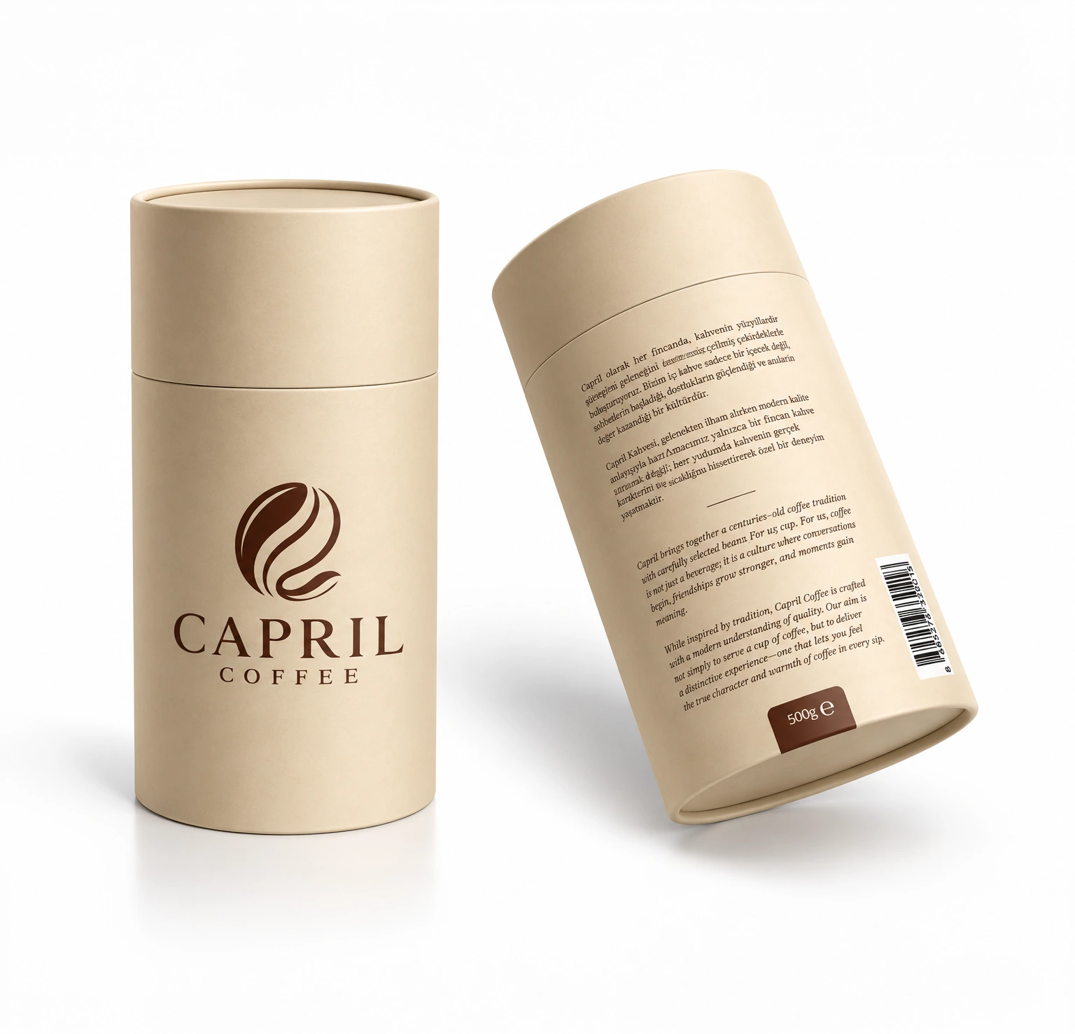
A cylindrical cardboard tube designed for Capril Coffee's 500 g Turkish coffee. A natural kraft-textured surface, single-color dark brown print and a simple layout bring the brand's warm, natural identity to the shelf.
1
The challenge
Capril, a new coffee brand, needed to stand out among crowded, glossy packaging on the shelf and give a "carefully made, natural coffee" feeling at first glance. The packaging had to look good both in the store and as a gift, and carry the brand story in Turkish and English.
The solution
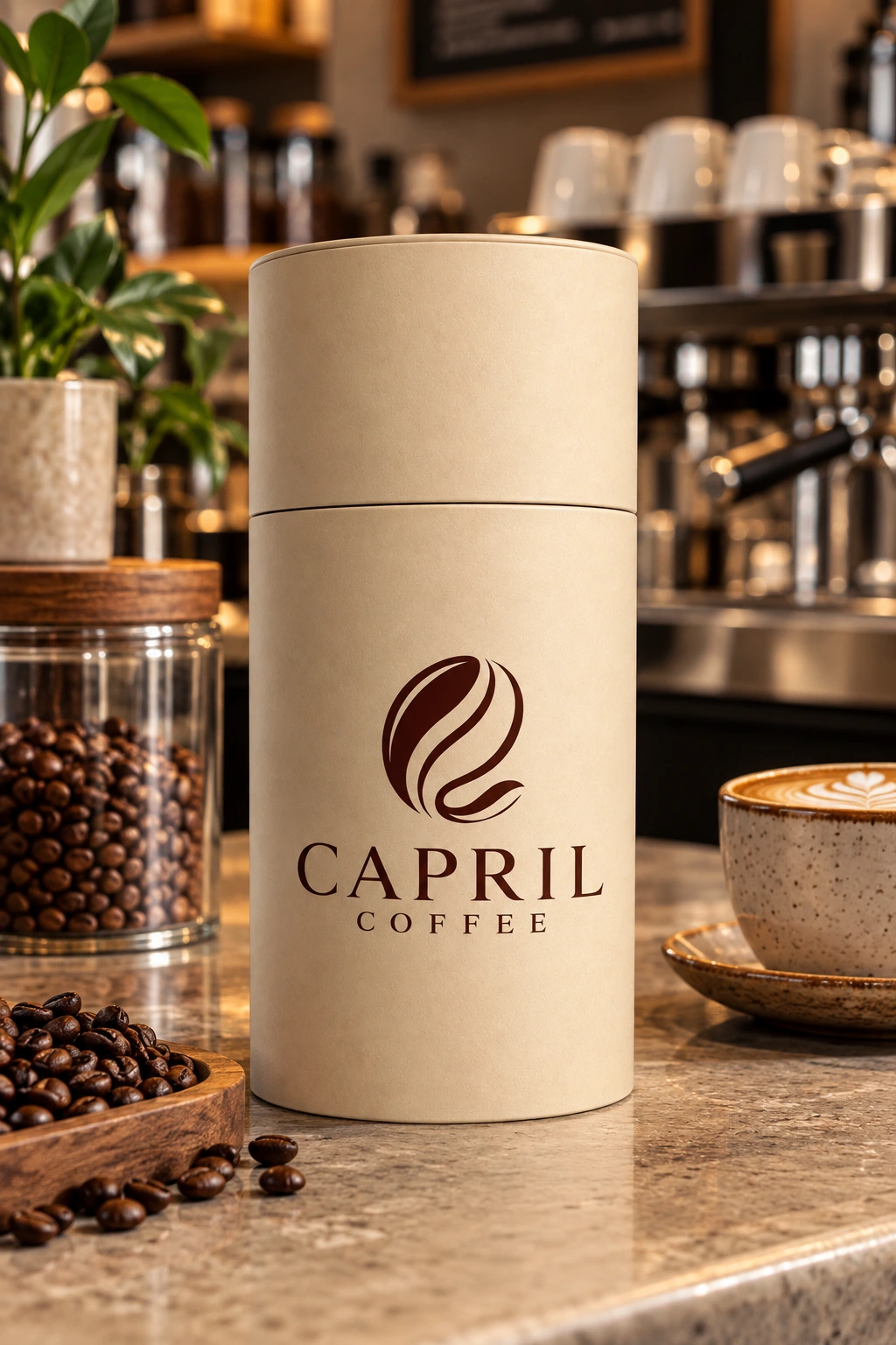
I chose a lidded cylindrical cardboard tube: packaging that can be reused and feels like a gift in itself. The front carries only the Capril emblem, derived from a coffee bean, and the logotype, with generous empty space letting the brand stand out.
On the back, the brand story is set in Turkish and English in a serif typeface, with the two languages separated by a thin line. The barcode and the 500 g weight label sit at the bottom, and the weight label is highlighted in the same dark brown as the logo. The single-color print, together with the kraft texture, gives the box a natural look.
The result
Capril now has packaging that looks simple and premium on the shelf and works well as a gift. Together with the cream and dark brown palette of the website, the box builds a consistent brand identity.